Work | Cactus Life Sciences Brand Launch
Revealing new levels of scientific perception
Cactus Life Sciences (CLS) launched with a clear ambition: to become a global leader in scientific communications for biopharma. While the organization had built a strong reputation as an offshore medical education company, its next phase required a fundamental shift—one that would resonate with US-based pharmaceutical clients seeking strategic partnership, scientific depth, and operational efficiency. This work focused on redefining CLS as a modern, full-service agency that leads with insight, operates with precision, and delivers at scale.
To support this evolution, the brand needed to communicate its value more clearly: delivering scientific strategy and content across the healthcare continuum with a focus on innovation, efficiency, and quality. The identity had to reflect both the depth of scientific expertise and the ability to simplify and scale complex information for global audiences.
Medical communications are often defined by volume, complexity, and rigid delivery models; innovation is frequently constrained by time and cost. For pharma teams under increasing pressure to move faster without sacrificing scientific rigor, this creates a gap between what’s possible and what’s practical.
The brand positioning was built to close that gap—combining depth of scientific expertise with a more efficient, insight-driven approach to delivery. The narrative centers on bringing clarity to complexity, enabling teams to communicate with greater precision, speed, and impact.
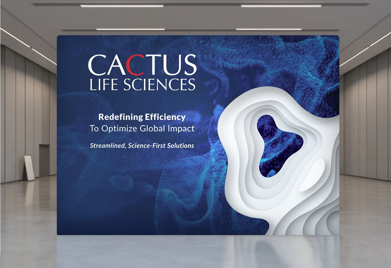
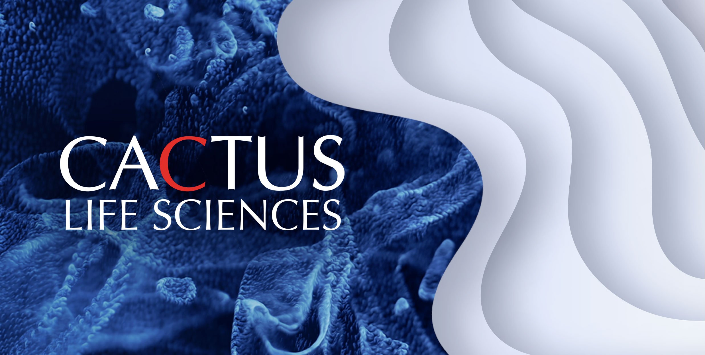
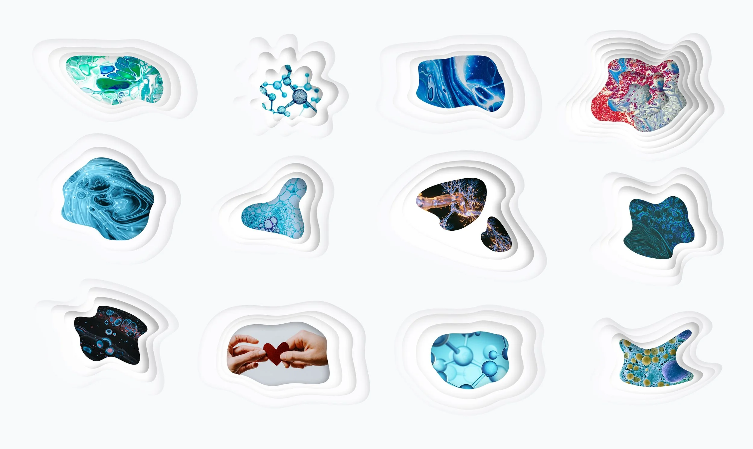
The identity system was designed to express clarity within complexity. A clean, modern aesthetic built on layered elements and clean geometry reflects the idea of uncovering deeper levels of scientific understanding—revealing multiple dimensions of insight and the ability to simplify and uncover meaning within complex data.
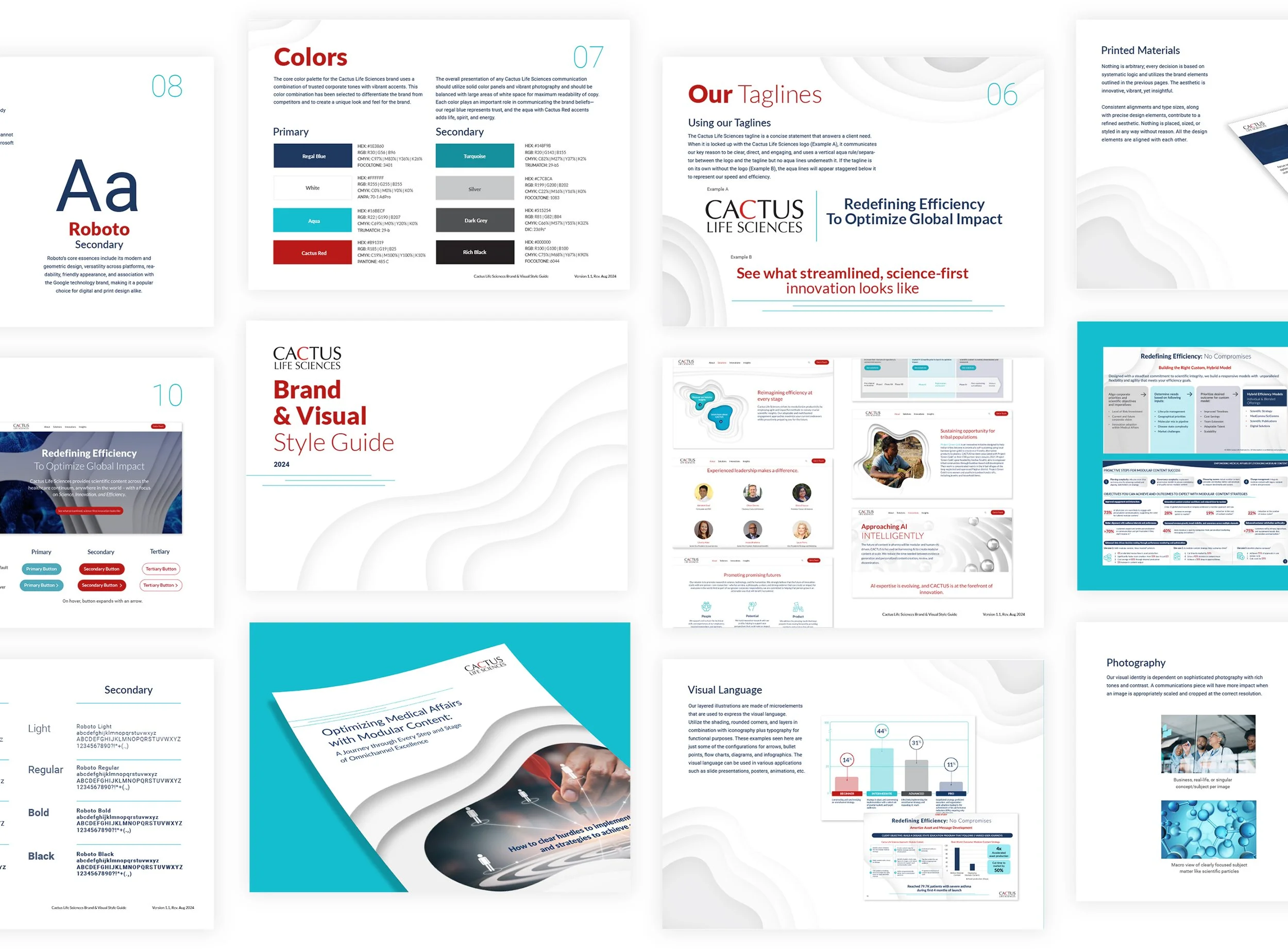
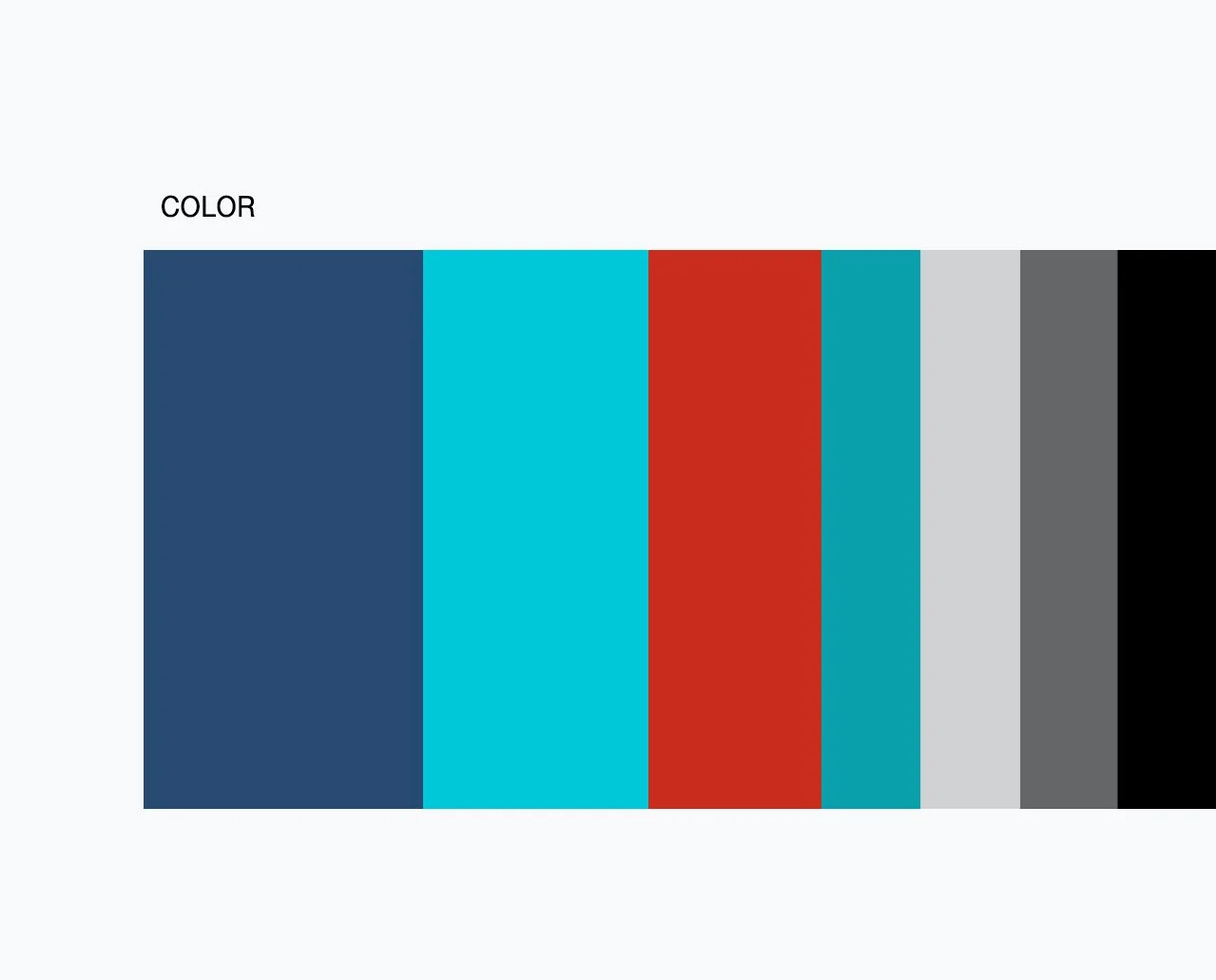
The color palette combines trusted corporate tones with vibrant accents, creating a distinctive and differentiated look within the category. Regal blue reinforces trust and credibility, while aqua and red introduce energy and momentum. The system is designed to work with bold color blocking, vibrant photography, and generous white space—ensuring clarity, balance, and readability across all communications.
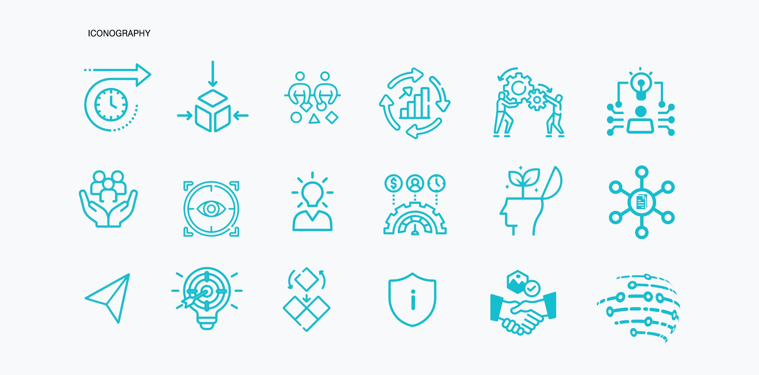
Illustration and iconography were developed as part of a broader visual language system, using simplified forms and layered compositions to support storytelling. These elements work in tandem with photography to bridge high-level scientific concepts with real-world impact.

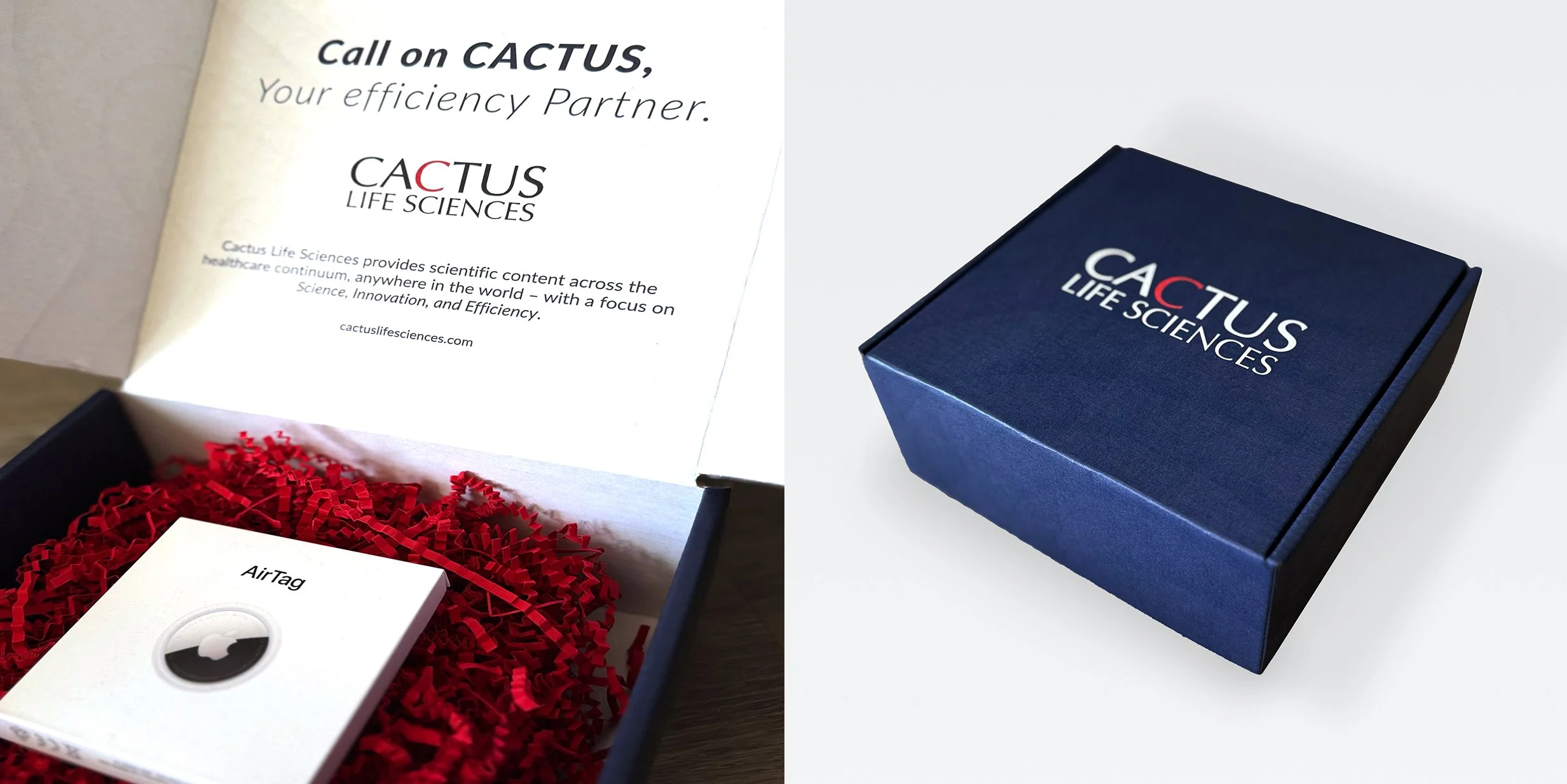
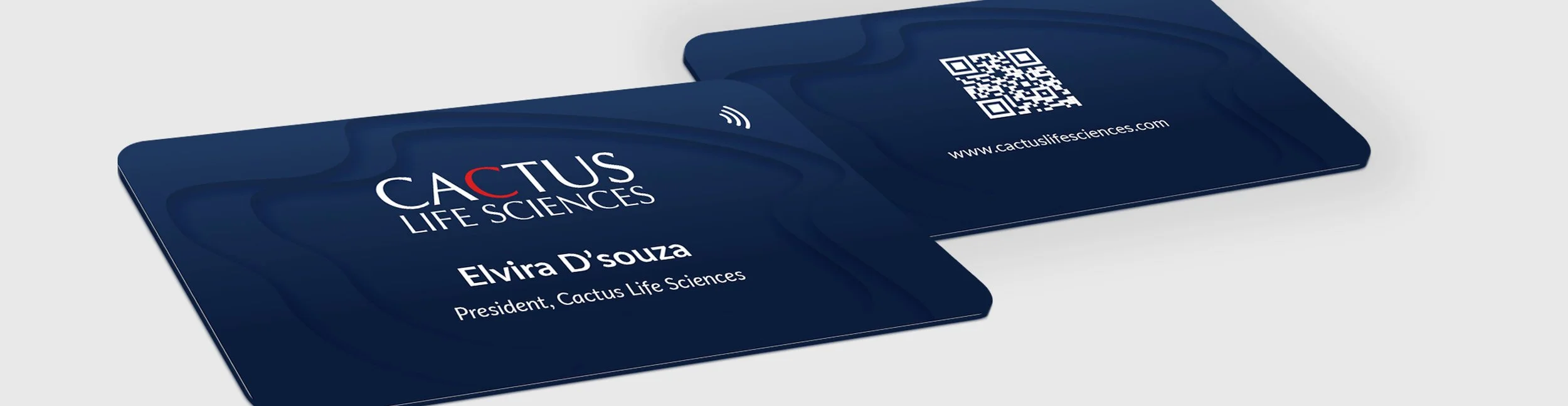
The identity was built as a comprehensive and scalable system, extending across brand guidelines, templates, and a component library to support consistent execution across a global organization. This enabled teams to produce content efficiently while maintaining a cohesive and elevated brand presence.
The brand extends across all touchpoints, from digital platforms to conference environments. A clean, modern aesthetic paired with dynamic visual elements allows CLS to present itself as a forward-thinking leader in medical affairs—one that is both scientifically rigorous and operationally agile.